Squarespace helps anyone build a beautiful wedding website online. We know what you’re thinking…in the midst of wedding planning how on earth am I going to make time to build a website? Don’t stress, Squarespace has seriously made it SO easy! By blending elegant design and sophisticated engineering, they empower couples to share their stories with the world. A beautiful wedding site shares your occasion with family and friends, acting as an announcement, invitation, RSVP, and more. In this guide, we’ll cover selecting the right template to celebrate your special day and specific Squarespace features to show off photos, create an easy RSVP form, and share your story with your guests.
STEP 1: Select a Template
Squarespace has this dialed in, gals! They have developed templates built with weddings in mind, complete with samples! From large scrolling banners to demo content designed to inspire, these templates will get your wedding site online quickly AND with ease! You can check out wedding templates here!
STEP 2: Own Your Name
All Squarespace sites on an annual billing plan receive a free domain for the first year! That’s right…free! Using a memorable name, such as the two of your names or a fun inside joke, helps guests remember your URL, making it easy to pull up your wedding site at anytime on a mobile device to check directions, show off a photo, or find links to your registry.
STEP 3: Create an RSVP Form
Streamline the RSVP process with a customizable Form Block. By connecting your RSVP form to storage options—an email address, Google Sheet, or MailChimp list—you can keep your guest list organized and stay in touch about any adjustments to the big day’s schedule.
STEP 4: Show Off Your Gorgeous Photos
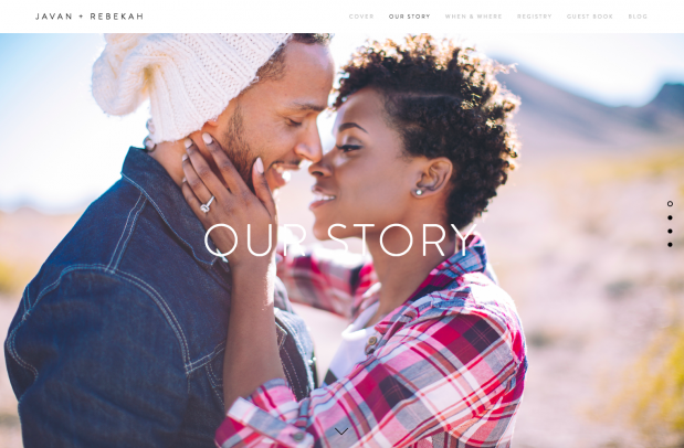
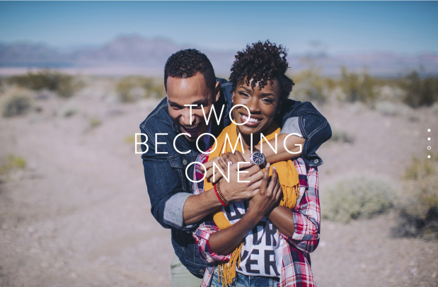
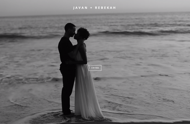
Depending on your template, you can use engagement photos and snapshots of cherished memories as banner or background images. This puts the happy couple front and center, making a strong visual impression. You can also include gallery pages to help share your story!
STEP 5: Display event details
A wedding site serves as an accessible reminder for locations, schedules, and other essential details. A Map Block helps guests locate your venue, while Text Blocks with formatted headings make it easy to spot crucial information, even when glancing at a mobile display. Finally, the Menu Block displays menus and lists ingredients, helping accommodate guests with food preferences, allergies, or dietary restrictions.
STEP 6: Add registries
Use the Zola Block to display a selection of items from your Zola wedding registry in a design that blends in with the page. This is a great way for visitors to browse your wish list without leaving your wedding site. In addition, by using Image Blocks and clickthrough URLs, you can create thumbnail images that link out to multiple registries.
What do you do now! Visit Squarespace and get started! You can even use the website after the event to share photos and videos of the wedding, and as a place to store memories of this special season! Once you get started, make sure to use code GLW to get 10% off your first purchase!
Images from Javan + Rebekah site, photography by Lauren Cowart


